 |
 |
 |
 |
 |
![]()
Volume 5,
Issue 3, Spring 2002
Visual
Storytelling and the Competition for Political Meaning in Political Advertising
and News in Campaign 2000
Glenn
W. Richardson Jr.
|
Printer-friendly PDF version AbstractEach new generation of campaign advertising involves ever more skilled uses of audiovisual rhetoric. While analysts have struggled to find ways to effectively and critically engage campaign commercials, the balance of power in the ad wars appears to lean toward those who produce ads rather than toward those who seek to counter them in pursuit of a vigorous and informed campaign conversation. The premise of this project is that in this environment, healthy political discourse calls out for analysis as skilled in the audiovisual arts as the ads themselves. Campaign ads use a wider range of techniques in visual communication than do television analysts and reporters, and they do so with greater force. Analysts may be well advised to take a page from the admakers as they contemplate how to better communicate themselves, and pay even more serious attention to the nuanced details of audiovisual communication. I briefly consider the efforts of journalists and academics to grapple with visual communication, then explore in some detail visual elements of political advertisements from the 2000 campaign. Data drawn from local and network television coverage of the campaign are used to compare the use of graphic and visual imagery in ads and news. I conclude by suggesting that the discourse of ad analysis must be extended beyond the mainstream media to include a broader range of voices if the visual communication of campaign advertising is to be truly engaged. |
Department
of Political Science Kutztown University of Pennsylvania P.O. Box 730 Kutztown, PA 19530 (610) 683-4450 http://faculty.kutztown.edu/richards/ richards@kutztown.edu Author's Note |
Enthusiasts, partisans, and liars have long tinkered with graphical evidence by dequantifying images, selecting and hyping advantageous visual effects, distorting data. Recently, inexpensive computing and ingenious techniques for image processing have provided endless new opportunities for mischief. Arbitrary, transient, one-sided, fractured, undocumented materials have become the great predicament of image making and processing. How are we to assess the integrity of visual evidence?
Edward R. Tufte, Visual Explanations: Images and Quantities, Evidence and Narrative. 1997.
Political communication has become increasingly audiovisual communication. Each new generation of campaign advertising is marked by ever more skilled uses of audiovisual rhetoric. This development has hardly gone unnoticed, as journalists and other analysts have struggled to find ways to effectively and critically engage campaign commercials. At the moment, however, the balance of power in the ad wars appears to lean toward those who produce the 30-second political spots rather than those who attempt to counter them in pursuit of a vigorous and informed campaign conversation. The premise of this paper is that in such an environment, healthy political discourse calls out for analysis as skilled in the audiovisual arts as the ads themselves. Campaign ads use a wider range of techniques in visual communication than do television analysts and reporters, and they do so with greater force. Analysts may be well advised to take a page from the admakers as they contemplate how to better communicate themselves, and pay even more serious attention to the details and nuances of audiovisual communication.
Academic researchers have long attended to issues of visual communication (1). In probing the nexus between audiovisual information, emotion and cognition, some students of political communication have begun to pursue multimedia research projects in an attempt to better come to grips with the audiovisual elements of news, advertising, and analysis (see for example, Boynton and Lodge, 1998; Dauncey 1998; and Richardson 1998a, all featured in a special electronic edition of the journal Political Communication published on CD-ROM, and Nelson and Boynton 1997). This work seeks to extend these efforts. I briefly consider the efforts of journalists and academics to grapple with visual communication, then explore in some detail visual elements of political advertisements from the 2000 presidential contest. Data drawn from local and network television coverage of the campaign are used to compare the use of graphic and visual imagery in ads and news. I conclude by suggesting that academic and journalistic efforts more aggressively engage issues of audiovisual communication, and that the discourse of ad analysis be extended beyond the precincts of the mainstream media.
The Rising Tide of Visual Political Communication and Communicators
In her book, Processing Politics: Learning from Television in the Internet Age, Doris Graber argues that the pervasive criticism of television as an information source has conflated the medium and the message. Visual communication, she argues, can serve as a powerful means of disseminating information. Most people, she notes, readily master the visual codes through which television tells stories, even as many never master complex verbal codes or reading (according to a 1999 United Nations study, 21 percent of American adults are functionally illiterate; Clarity 1999). Visual communication is so powerfully effective because our brains can process multiple visual images simultaneously, while verbal or written information must be processed serially (Pavio 1979; Van Der Molen and Van der Voort 2000). Graber suggests that visual information can ease the effort involved in "bottom-up" processing of new information (where incoming information is subject to fresh appraisal), which can reduce the errors associated with "top-down" processing (where viewers interpret new information in terms of preexisting patterns or forms in memory), often erroneously reconstructing false details that fit with the preexisting form (Graber 2001).
Yet, even for Graber, the news on television is not all good. She concedes many of the points made by the medium's critics: news often focuses on the dramatic, visuals can be deceptive (especially when unfamiliar situations are involved), many of the visuals in TV news are completely uninformative, and, especially among less sophisticated viewers, vivid visual imagery can distract attention from important substantive details. In the final analysis, however, Graber is optimistic about the medium's potential, because it eases two major information processing problems: embedding information in long-term memory and retrieval of stored information (Graber 2001).
Perhaps, then, there is some cause for optimism in the convergence of several technological developments that brings the potential to unleash a tidal wave not just of visual communications but of visual communicators. Powerful and easy to use video editing software, emerging digital video recording, the Internet, and wireless communications provide those who can afford them the opportunity to tell their stories with unprecedented audiovisual richness. It would seem plausible at least, that the spread of such an emotionally powerful form of communication would reverberate deep into the wellsprings of culture and society, as had earlier communications advances such as the telegraph, telephone and television. With such penetration one might also expect to see increases in visual literacy and artistic expression and appreciation. Already, user-friendly animation programs have spawned an Internet explosion of computer-assisted cartoons produced by young amateur artists (Weber 2001; see for example the animations "Corporate Puppet" and others found at newgrounds.com). In short, the processing of visual information is poised to become even more central to human communication than it already is. The information tide Graber (1988) studied more than a decade ago is increasingly becoming a tidal wave of visual information.
While Graber is generally sanguine regarding the prospects of visual communication in theory, the liabilities of visual communication in practice, as even she acknowledges, are formidable. The great danger, as Murray Edelman argues, is that in practice, social institutions such as the mass media propagate the illusion of beneficial social change while erasing the actual possibility of such change (Edelman 2001). In fact, mass communication may have principally evolved to this point not as a means of liberation, but as a means of subjugation (Robins and Webster 1999). While the potential may exist for the visual media to educate and enlighten, the reality may be that the ability of each new generation to recognize and consume visual information may be growing but the ability to critically engage and deconstruct visual appeals may not be advancing. Much is at stake, therefore, in cultivating critical visual literacy among citizens.
The worlds of commerce and politics have long witnessed the growing presence of audiovisual communication, most notably in televised advertising. Pressed to communicate in 30-second packages, admakers have honed their audiovisual, narrative, and emotional appeals to a fine art. Though ad campaigns are often carefully prescreened with focus groups and their themes are frequently drawn from the fabric of popular culture, they remain, importantly, largely one-way communications. While we have all been consumers of audiovisual information, we are on the threshold of finding legions of visual communication producers in our midst. In such an environment, journalistic reticence to engage the full arsenal of visual communications might come to be seen as liability. Indeed, many journalists have already begun to pay much greater attention to a variety of visual communications issues.
Analytical Approaches to the Visual Elements of Political Communication
Even as journalists have watched these things happen, indeed have written about them, responding to them still has proven to be a significant challenge. The conventions of reporting have provided the bedrock grounding for generations of print and broadcast journalists, and becoming more engaged in audiovisual production would not obviously seem consistent with the highest callings of the civic purposes of the press. There is a long running current of thought that views audiovisual communications as essentially aesthetic in their persuasive appeal, and as such far less reliable than the logically grounded argumentation of the printed or pure text (some see this perspective as Aristotelian in origin; see especially Nelson and Boynton 1997: 87-102; 206-17). Setting aside the theoretical issues, it is possible that empirically, such a position is becoming increasingly untenable.
An age-old aphorism claims a picture is worth a thousand words.
We are, I am told, seeing the emergence of a visually oriented and visually
literate generation, many of whom are "visual learners."
If so, greater attention to the elements of audiovisual communication
in news may serve the highest civic purposes. Indeed, that process has
already begun. Following the 1988 presidential campaign and the
perceived complicity of the media in the Bush-Quayle team's manipulations,
the press became much more attuned to campaign advertising and to their
own role, often unwitting, in reinforcing some of the ads' more questionable
elements. Kathleen Hall Jamieson's pioneering work led to the development
of a visual grammar for adwatch journalism, (Jamieson
1992; see Figure 1), marking the recognition that the audiovisual
elements of news required detailed care and attention (2).
|
Figure 1. The visual grammar of adwatch journalism |
||||
|
Perhaps the key lesson drawn from the inadequacy of journalists' treatment of campaign advertising in 1988 was that verbal messages were insufficient to counteract more powerful visual claims. While reporter Threldkeld was verbally denouncing the misleading claims in "Tank Ride," those very claims were vividly being displayed visually on the screen. Jamieson reported that viewers mistakenly identified the ad clip as news (which, in fact, it had once been). It took the Jamieson team literally years to come up with an effective "grammar" by which journalists' critiques of campaign ads could be conveyed visually. The ad clips were relegated to display inside a canted, graphic representation of a TV screen, with labels plastered over that screen containing the analysts' critical assessments. Graphic labels also clearly identified the video as coming from a campaign ad.
Another element of Jamieson's grammar was the inclusion of network logos in all adwatch frames. The logos were designed to discourage producers of political advertisements from copying the look of the adwatch in their own work, subverting the press's attempt to provide visual distance between news and ads. Copyrighted corporate logos, however, appear to have done little to prevent admakers from appropriating whatever forms (if not contents) help them to communicate their messages. Below, I will describe how, by 2000, political advertisers had appropriated some of the very elements of Jamieson's visual grammar for their own partisan purposes.
In fact, it may now be the case that analysts would be well advised to take a page from the admakers, and make greater use of the audiovisual resources they have so adroitly deployed. In short, ads may be more effective in communicating cognitive linkages and emotions than news analyses. Use of some of the techniques of ads could facilitate more effective communication by journalists. The emergence of an increasingly audiovisual-literate public makes such moves all the more appropriate.
The power of visual information is at once obvious and elusive. While much of the research about local and network news has emphasized its verbal content, an extensive literature has explored the salience of visual imagery. Crigler, Just and Neuman (1994:133) note that despite the fact "hundreds of studies have been conducted over the years on various aspects" of audio and visual effects, "there is no evidence of consistent or significant differences in the ability of different media" (i.e., audio v. visual) "to persuade, inform" or "instill an emotional response" in audiences. This is not to suggest that visual communication doesn't matter, only that it has not proven to be more effective than audio or narrative communication. Indeed, several studies have linked vivid visual information with heightened memory and recall (Graber 1988, 1990; Gunter 1980; Newhagen and Reeves 1992; Newhagen1998; Robinson and Levy 1986). Indeed, Graber (1988) found that nearly half of the visual scenes in TV news enhanced the verbal story line. One reason for the ambiguity in extant work may be the way audio and visual elements of communication interact with each other and with the subject matter (Tsuneki 1988). Graber's work is particularly on point, as she focuses on the connections between narrative, audio, visual and emotional information in memory (see also Crigler, Just and Neuman 1994 on how audio, visual and narrative elements combine).
Another factor that may have limited researchers' ability to gauge the effects of visual communication may be linked to the way the brain processes visual information. Rather than deriving meaning exclusively from narrative linkages, visual information is also processed holistically (Gibson 1961, 1966); Barry (1997) describes the process in terms of gestalt theory. Consider how it is possible to be unable to describe what a person whom you haven't seen in a very long time looks, yet be able to immediately recognize all the ways they've changed when you finally do see them. That is, visual information is often processed in terms of how it fits or deviates from existing patterns. For the viewers Graber (1988) studied, both visual and audio information were processed at least in part schematically, that is, in terms of their fidelity with existing constructs. One particularly telling indicator was the way that viewers embellished their recollections with details that, while not actually present in the stories they watched, were nonetheless schematically consistent with the story as a whole, a theme we will return to below. In short, just because research subjects cannot articulate details of visual communication does not mean that communication was meaningless.
Finally, as Messaris (1997) notes, visual communication lacks a defining propositional syntax, or the grammar by which images can be related to one another in terms of analogy, contrast, causality or other propositions. It is not that visual conventions for conveying contrast and causality are completely nonexistent, but rather that the same visual syntax can be interpreted differently by different viewers. This also allows political admakers to advance claims visually while maintaining "plausible deniability" in regards to specific elements of the message, which, after all, are subject to conflicting interpretations.
Visual Political Communication in Campaign 2000, the Bush Ads: Al (Clinton-)Gore Lies on TV.
The Bush-Cheney advertising campaign against Vice President Al Gore provides an illuminating glimpse into how audiovisual, narrative and emotional elements combined to effectively communicate what the Voter News Service exit poll suggested was one of the Republicans' most relentless, effective, and damning indictments of Campaign 2000: "Al Gore will say anything."
As the election neared, the US economy seemed to soar on the wings of record growth, the nation was essentially at peace, and President Clinton's job approval rating was at or near historic heights (he would leave office with the highest final job approval of any president). Largely based on these elements, many academic election forecasters predicted Gore to win the vote in the fall, and, for the most part, with a rather comfortable margin of advantage. When Gore's victory failed to rise to expectations, analysts focused on a range of explanations, including suggestions that the Gore campaign was particularly weak or ineffective. Indeed, after the election, one Bush campaign operative recalled worrying during the debates that Gore would ask, "which part of peace and prosperity don't you like?"
In fact, the nation's economic condition was more complicated than the GDP growth rate most forecasters relied upon suggested. The growth in real disposable income (RDI) per capita in 2000 was actually slightly lower than the postwar average during presidential election years; combining a wide range of election models, Larry Bartels and John Zaller found that the 2000 election actually fell remarkably close to the consensus forecast (Bartels and Zaller 2001).
Yet exit poll data suggests other forces were at play as well. While Clinton's job approval was high (though lower among voters on election day than among the American people as a whole), nearly two-thirds of voters surveyed had a negative view of Clinton personally. After all, as a GOP consultant remarked about press attention to various and sundry scandals, Clinton had been subjected to what amounted to the "longest running negative advertisement in history." By the fall of 2000, Clinton's conduct had become the major unarticulated premise of the campaign. Because the narrative, audiovisual and emotional elements of the discourse had become so well known and so well fused together, merely evoking one prominent element could evoke the entire complex of cognition and affect. And so it was that George Walker Bush ended each campaign appearance with his pledge to restore honor and dignity to the White House, a transparent attack at the incumbents, and his line was usually met with the most vociferous response of any he delivered. And so it was that while Republican ads rarely mentioned Clinton in a disparaging fashion, in visual terms they relentlessly linked Gore with deep and sticky webs of unfavorable associations viewers held toward the Clinton-Gore administration.
Scholars have noted the holistic way narrative, audio and visual elements of campaign ads draw upon widely recognized networks of conventional understanding to provide the form or structure that viewers often use to reconstruct the meaning of political communication (Nelson and Boynton 1997; Richardson 1998a, 2000, forthcoming). If an advertisement uses the audiovisual conventions of the widely recognized horror genre (films such as Scream, Friday the 13th, etc., which frequently use dark visuals, ominous and foreboding musical scores, and terrifying "slasher" sound effects), for example, viewers are more likely to draw emotional and narrative linkages consistent with horror stories (i.e., anxiety, fear, etc.). Indeed, sometimes viewers reconstruct details that are generically consistent (such as flags in a patriotic setting) that don't actually appear in the ads (Richardson 1998a, forthcoming; see also Graber 1988 for schematically consistent embellishments by viewers of TV news). When a narrative and audiovisual package becomes widely recognizable, it provides an especially effective cognitive "shorthand" for communicating emotionally powerful messages. The holistic functioning of the elements of the package, (the way they work and fit together) allows those familiar with the package to fill in details (about related objects such as candidates) consistent with it, even if they in fact are not present in that candidate to the degree the package would suggest.
The media's incessant all-Monica, all-the-time bender (and to a lesser degree focus on other Clinton "scandals") served to indelibly mark upon the public's memory a series of visual, emotional and narrative linkages. With the passage of time, the most scandalous behavior may prove to have been not the unfaithful president's, bad as that was, but that of investigative journalists (Kalb 2001) and the president's various accusers (Conason and Lyons 2000). But for an extended period of time, televised images of tense White House press briefings, and alternatively scandalous, embarrassing, and revolting reports and revelations flickered across TV screens around the country. What the Bush-Cheney campaign was able to do in their ads was to visually graft this sordid and long running national soap opera firmly onto viewers associations with Al Gore. In cognitive terms, the Bush ads primed viewers to activate elements negative to Gore, rather than other available but less negative webs of associations they might possess regarding the vice-president.
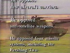
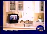
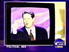
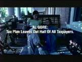
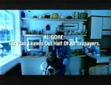
The key visual component of this strategy was to show Gore, when he appeared
in Bush ads(3), always on a canted television screen
(Gore on a TV set on a kitchen countertop, or with the silhouette of a
canted TV screen superimposed over images of Gore, etc.; see Figure 2).
Computer graphics simulating fuzzy static punctuated images of Gore to
further emphasize that he was on TV, presumably suggesting the untrustworthiness
of both the man and the medium. The very visual grammar that
allowed adwatch journalists to more forcefully convey their critique of
campaign spots powerfully invites viewers of the Bush ad to activate unfavorable
networks of associations with Gore. Indeed, the explicit use
of a canted television within a visual frame in adwatches (which more
than likely criticize rather than praise) signals the kind of distortions
and transgressions that warrant action by the ad patrol.
|
Figure 2. Gore was always shown "on TV" when he appeared in Bush ads. |
||||||||
|
The power in the Bush approach is that it relies on a widely recognized package of audiovisual, narrative and emotional information. The impact of the pieces together is greater than their separate elements. How the images and the narrative fit together is significant. Gore, for instance, could have tried to use the same visual strategy Bush used. And while the image of any politician "on TV" might invite certain levels of distrust, such sentiments would not be as emotionally vivid as the specific links with the Clinton-Gore scandals that defined not only politics but popular culture as well for an extended period of time. Clinton's conduct had become a staple of late-night television shows like the Tonight Show with Jay Leno on NBC, the Late Show with David Letterman on CBS, and ABC's Politically Incorrect with Bill Maher. Such programs are actually an important sources of political "news" for many Americans. Half the respondents in a January 2000 Pew Research Center survey said they regularly (16%) or sometimes (35%) glean information about the candidates from comedy programs such as Saturday Night Live and nontraditional outlets like MTV. These figures rise to 24% and 55%, respectively, for those under age 30. During the final months of 2000, Letterman even began recycling Clinton humor with a "classic Clinton joke" feature where he revisited jokes from years gone by. The standards for "truth," or at least what becomes popular wisdom, are much lower than even those of journalism, let alone those of the courtroom. The Bush ads were able to draw upon these widely held "understandings."
In any event, Gore's ads did not attempt to always depict Bush as "on
TV." Some Gore ads, for example, did feature images of Bush
speaking. Bush was even relegated to a box in a portion of the screen.
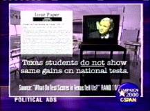
But the box was not recognizably a TV. In one Gore ad, Bush was
shown on a TV. In that ad, however, the TV itself was placed in
the context of a graphic representation of an issue paper (criticizing
the Texas governor's claim to having improved the test scores of his state's
students), and against the backdrop of an empty classroom. In the
Gore ads, the package of elements that worked so well in the Bush ad is
lacking. The simple politician on TV has become the more ambiguous
politician on a TV in an empty schoolroom. Gore's ad team needn't be faulted
for this. They're trying to tell a different story.(4)
As the name of the website that appears at the end of the ad (1800thefacts.com),
the Gore message is the facts are on our side. The classroom setting
is consistent with that appeal, and Bush on a TV does work in that context.
But it is part of a different whole (see Figure 3). Visually, the Gore
ads might even appear to be Bush ads if you don't read the text and discount
the slightly less than flattering images of the Texas Governor. It is
hard, however, to imagine the Bush ad's visuals appearing in a Gore ad.
|
Figure 3. Bush Appearing in Gore Ads |
|||
|
|||
|
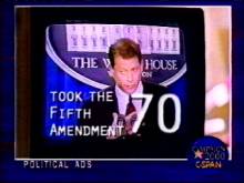
By contrast, in the Bush ads, familiar backdrops such as the White House
briefing room combine with the unflattering slow motion images of a defensive
politician. The visual image alone evokes the narrative of a defensive
Clinton or Gore and all the accompanying baggage they carried. The
backdrop at the White House briefing room is familiar, and the use of
hyper-close-ups primes viewers to draw upon more negative associations
than might otherwise be the case. When I've shown several of the
Bush ads to students in the classroom and then asked where they remember
Gore as being when he was shown in the ads, some invariably remember "the
White House." When asked what else that reminds them of, some
volunteer "Clinton." This is not surprising, given the
saturation level coverage of the scandal-prone president. This then
becomes a tempting vehicle the Bush campaign can use in its ads, effectively
melding press coverage of Clinton's serial indecencies and deceptions
to media reports of Gore's "exaggerations." Even those
who are inclined toward less upsetting associations regarding President
Clinton, will probably find the slow-motion video clips of Gore waving
his finger, highly evocative of Clinton's own now infamous finger waving
denial. If, in fact, viewers draw such associations between Gore
and Clinton's worst qualities, it would mark a particularly effective
communication of one of the GOP's main campaign appeals (see Figure 4).
|
|
|||
|
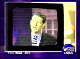
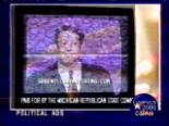
The Bush ads where the TV Gore appears on is set in a spacious, moderately upscale kitchen, keenly capture the emotional distress caused by the worst of the Clinton administration's scandals by reminding viewers of the particular discomfort of having the family dinner punctuated by journalists and politicians probing the intimate details of the president's affair with the promiscuous intern. But now, it is Gore "lying on TV," not Clinton. Memories tagged with such emotionally riveting content are more easily stored in our brains, and more readily recalled even if they are not "rehearsed" or recalled frequently (Graber 2001). Try as we might, we cannot prevent the Bush ads from dredging up these affective responses and cognitive associations. The political power of the ads lies in transferring onto Gore that which originated with Clinton.
Gore's own "problems with the truth" took on a life of their own. Consider the rap on Gore as serial exaggerator which found great currency in the press, despite lacking substantial basis in fact. Gore's "claim" to having "invented the Internet," for example, rested on a misquote of Gore's remarks and a carefully choreographed public relations campaign orchestrated by Republican party operatives (Parry 2000). Gore was in fact an early advocate of efforts to create the Internet as we know now it; and he is widely credited with popularizing the phrase "information superhighway" through his tireless crusade to promote cyber communications. As one observer put it, "behind every major invention and inventor stands a patron. Behind the Internet stands Gore." (Coopersmith, 2000).
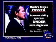
But far fewer Americans were aware of this than would have been familiar with the endless parade of jokes from TV's late night comics about Gore inventing stuff. Ultimately, the image of Gore as a liar/exaggerator could stand on its own, and be deployed by the Bush campaign to devalue Gore's position on completely unrelated issues, such as education and prescription drugs. The conclusion of one such Bush ad offers an illustration of how audio, visual and narrative elements can be choreographed to create an effect more impressive than those same elements in isolation would be able to do (see Figure 5).
|
Figure 5. The Interaction of Audio and Visual Communication "A Prescription for Disaster . . . For You!" |
||
|
|
||
|
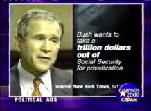
Al Gore chose to kickoff his health care message in a town-hall meeting with 200 retirees on August 28 in Tallahassee, Florida. After hearing several complaints about prescription drug costs, he suggested the pharmaceutical industry should lower prices. According to the Tampa Tribune, Gore offered as an example his mother-in-law, Margaret Ann Aitcheson, whom he suggested paid more ($108 per month) for her arthritis medication (the prescription drug Lodine) than it cost to fill his 14-year old black Labrador retriever Shilo's prescription for the same drug (less than $39 per month). "Don't you think that ought to be changed?" he asked (Wasson 2000). Three weeks later, the Boston Globe reported that Gore had "mangled the facts," relying not on personal experience but on a House Democratic study (which in turn relied on wholesale rather than retail costs), assuming that the dosages were the same and ignoring the fact that a generic equivalent was available (Robinson 2000). Governor Bush seized on his rival's remarks as further evidence that Gore had a tendency to "make up facts to make his case," and that "he'll say anything to be the president" (Seelye 2000). Gore's aides suggested that the vice president's overall point was valid; indeed, the New York Times reported that a check of "several pharmacies and veterinary clinics in Washington found a price disparity between Lodine and Etogesic (the dog version) capsules roughly similar to that given by Mr. Gore," though the capsules were of different sizes (Seelye 2000); moreover, overall drug costs had risen by 13 percent or more every year since 1996 (Associated Press 2001). But for the press, pundits, late-night comics, and Republican loyalists, it was yet another example of Gore's fabrications. Gore's remarks were featured prominently in a Bush ad aired during the closing weeks of the campaign. It is a particularly telling example of the way audiovisual communication can distort and mislead. In doing so, the Bush ad draws upon strategies of visual manipulation that Tufte found in classic texts of magic: suppressing context and preventing reflexive analysis. (emphasis in original; Tufte 1997: 68)
The ad starts with a video clip of Gore inside the silhouette of a TV,
appearing to be talking and gesturing to a pharmacist. The narration
begins, "Remember when Al Gore said his mother-in-law's prescription cost
more than his dog's? His own aides said the story was made up."
(A newspaper clipping from the Washington Times appears on
the screen; the image fades into a white screen with black lettering "Now
Al Gore is bending the truth again," as the narrator says the same thing.
Gore reappears, again in the silhouette of a TV, waving his finger a
la Clinton. Above him read the words "Wall Street Journal, October
26, 2000" as the narrator continues, "the press calls Gore's social security
attacks nonsense" as the word "nonsense" is superimposed over Gore. (Of
course, more accurate would be "the editorial board of the Wall Street
Journal calls Gore's social security attacks nonsense.") The
ad shifts to a video clip of George Walker Bush wearing a suit and a hard
hat, with the words "Governor Bush: $2.4 Trillion to Strengthen
Social Security & Pay All Benefits" superimposed on the screen as
the narrator says "Governor Bush sets aside $2.4 Trillion to strengthen
social security and pay all benefits." The ad then shifts back to
the TV silhouette, with an animated and perhaps slightly agitated Gore
at the podium during a debate. He says, "there has never been a
time in this campaign when I have said something that I know to be untrue.
There has never been a time when I've said something untrue." The
TV silhouette and Gore in it fade, revealing the word "Really?" in black
text on a white background as the announcer asks somewhat incredulously,
"Really?" Viewers I've shown the ad to often assume the footage
of Gore is taken from his October debates with Bush. This is consistent
with the holistic, top-down processing of visual information. The
presidential debates were second in audience only to the August conventions,
and clips from the debates were replayed with frequency on TV news.
So when an image of Gore in a debate is shown (a detail), it is not surprising
viewers might assume it was from Gore's debates with Bush (a familiar
form). Only upon closer examination does it become clear that it's
not the Texas Governor at the opposing podium, but rather former New Jersey
Senator Bill Bradley, debating Gore nearly a year earlier, before the
Iowa precinct caucuses (see Figure 6).
|
Figure 6. Audio Visual and Narrative Distortion of Time and Place |
||
|
There are many plausible ways to read Gore's "exaggerations." The media certainly has a right to focus on whatever issues it thinks are important, to press candidates to respond in detail, and to take such detailed indications and explore their significance in depth. The Bush campaign, too, has a right to push its own interpretations of the vice-president. The Internet address gorewillsayanything.com featured at the end of some of the ads succinctly captures the Bush-Cheney perspective. The danger for those in the press inclined to draw attention to Gore's exaggerations is that they will be swept up in the vortex of the partisan perspective. The stories about Gore's exaggerations readily meld with the Bush campaign spin that Gore will say anything. Indeed, the VNS exit poll found that 74 percent of voters agreed with the statement that "Gore will say anything." Only 58 percent agreed that "Bush will say anything."
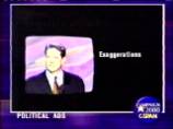
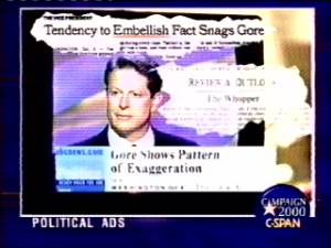
A Bush ad visually invites precisely this interpretation.
Headlines torn from the pages of the nation's newspapers are emblazoned,
adwatch style, over the familiar images of Gore on TV. In the visual
meltdown that frequently represents memories and thoughts, the charge
that "Gore exaggerates" (the press) morphs into "Gore lies
like Clinton" (the Bush ad), reinforced by the independent credibility
of the press. Many will confuse where they saw it, heard it, or
read it, but will nonetheless accept the depiction of Gore as truth-challenged
(see Figure 7).
|
|
||
|
Visual elements are central to understanding the meaning of campaign discourse. Visual communication is both detailed and holistic. Forms provide the structure for interpretation, and in some cases, reconstruction or even generation of details. To neglect the audiovisual elements of campaigns and especially campaign advertising is to neglect a part of their essence.
A Comparison of Visual Imagery in Ads and News in Campaign 2000
What follows is a brief examination of the ways ads and news engaged visual communication in campaign 2000, based on an exploratory analysis of broadcasts of local and network news, and focusing on the nature of linkages drawn between candidates and the narrative and audiovisual content of news and campaign advertising. This is but a narrow sliver of the range of issues raised by journalistic treatment of audiovisual information, but it is a potentially significant one nonetheless. The above analysis makes the case that audiovisual linkages can be important components of political communication. How effectively journalists can engage audiovisual information will affect how effectively they can engage political communication.
One of the key elements of the Bush ads, and of campaign ads generally, is their ability to draw graphic linkages between candidates (either themselves or their opposition) and other people, things or emotions. Graphic information can be less linear than text. It can also be powerful in shaping pattern recognition. Both elements may be of use to analysts. To more fully do so, however, reporters may wish to consider how much more often campaign ads use graphics than does TV news.
Dimensions of visual linkage in political communication
Because candidates are so central to campaign coverage, serious attention to how ads and news link visual information to candidates is substantively warranted while also providing potential insights into broader communications issues. Linkages between visuals and candidates can be made on one of three levels: narrative linkages, where visuals are linked to a candidate by a story line; verbal linkages, where visuals are simultaneously linked by a narrator's or reporter's words to a candidate, and graphic linkages with images of the candidate. In narrative linkages, images would appear but they would be tied to a candidate only by a larger storyline or analytical framework. Neither spoken words nor visual imagery would specifically tie the image to the candidate. Verbal linkages combine a narrative connection with an explicit audio connection between the image and the candidate (a voice mentioning the candidate's name accompanies the image). Graphic linkages use visual imagery to communicate the connection between the candidate and what is shown.
The visual grammar of candidate comparison in ads and news
One way to gauge issues of linkage of visual communication is to explore
the visual grammar of candidate comparison in ads and news.
There are two primary ways comparison can be visualized. First there
is simultaneity, or visual parallelism, which involves showing both candidates
(or their names and various attributes or positions) on screen at the
same time. Tufte writes, "spatial parallelism takes advantage
of our notable capacity to compare and reason about multiple images that
appear simultaneously within our eyespan. We are able to canvass, sort,
identify, reconnoiter, select, contrast, review – ways of seeing
all quickened and sharpened by the direct spatial adjacency of parallel
elements" (Tufte 1997:80). Such side- by-side
comparison is somewhat common in ads but not so in news (see Figure 8).
|
Figure 8. Simultaneous Visual Comparison |
|||
|
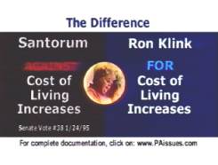
Simultaneous visual linkages are examples of graphic linkage, where the connection between the candidate and the image is explicit. Alternatively, a second technique for visualizing comparison is "adjacency," or sequential presentation of images (first one candidate is shown, than the other). For Tufte, this would be an example of temporal parallelism (1997:80). Adjacency typically involves narrative linkage and may involve verbal linkage. There is nothing explicit in adjacent images themselves to visually tie different but sequential images together. One needs to be aware of the narrative or verbal context of comparison to effectively process the imagery. As Tufte notes, however,
Connections are built among images by position, orientation, overlap, synchronization, and similarities in content. Parallelism grows from a common viewpoint that relates like to like. Congruity of structure across multiple images gives the eye a context for assessing data variation. Parallelism is not simply a matter of design arrangements, for the perceiving mind itself actively works to detect and indeed to generate links, clusters, and matches among assorted visual elements. (1997: 82)
Adjacency (or temporal parallelism) is a common way of visualizing linkage
in both ads and news. (See Figure 9 for an example of adjacency
in campaign advertising).
|
Figure 9. Visual Linkage through Adjacent Imagery in Advertising |
||
|
||
|
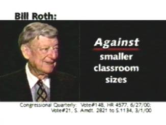
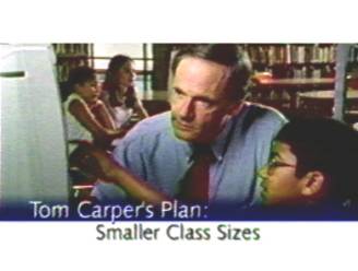
The communication of comparison through sequential imagery can be amplified
by visual punctuation of adjacent images. In one Bush ad, for example,
an image of the Texas governor sitting with schoolchildren becomes visibly
brighter through a starburst like visual effect, providing stark contrast
with the darkened images representing Al Gore's plans. Barry
(1997:134-35) suggests darkness and light can exert "profound effects
on emotional states," noting humans' primitive fear of darkness (see
Figure 10).
|
Figure 10. Visually punctuated adjacency in comparison by sequential imagery. |
||||
|
||||
|


The visual grammar of non-comparative linkages in news.
Adjacency is also common in news, both in direct comparisons and as a
means of visually tying together elements of a larger narrative.
A CBS Evening News story highlighted violent criminals with mental
problems who were given concealed weapons permits under a law signed by
Governor Bush who then when on to commit crimes including murder and assault.
The criminals, shown in a graphic image of cascading mug shots, are linked
to Bush sequentially. The next frame links Bush to the crying victims
(see Figure 11).
|
Figure 11. Visual Linkage through adjacent imagery in news. |
|||
|
|||
|

Both news and ads use fades as a way to further amplify the visual linkage of sequential images. Fades literally allow one image to bleed into another, powerfully conveying connection. The CBS Evening News story on Texas's concealed weapons law and the violent murderers who were allowed to carry did not use fades between the images of the murders, Bush and the victims. Doing so would have no doubt further amplified the visual connection between Bush and the consequences of his policy.
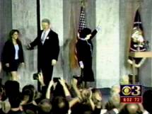
A story on local CBS affiliate KYW in Philadelphia did use fades in a
story about a joint campaign appearance featuring President Clinton and
Democratic House candidate Susan Bass Levin. A wide-angle shot of
Clinton and Levin arriving on stage at the rally fades into a close up
of Levin being interviewed by the one of the station's reporters.
The fades serve to highlight the linkage between the images of Clinton
and Levin (see Figure 12).
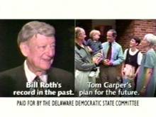
|
Figure 12. The use of fading images to highlight linkage between sequential images in news. |
|||
|
|||
|


Another way of visually linking information to candidates is to do so
directly through graphics. Graphics can include the candidates name or
image as well as additional graphic or textual information (see Figure
13).
|
Figure 13. Graphic visual linkage in news. |
|||
|
Of course a given news story can combine several elements of visual linkage.
Sequential linkages can follow or precede graphic ones and so on.
Graphics can also be used to highlight the sequential nature of two parts
of story substantially separated in from each other by time and intervening
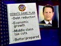
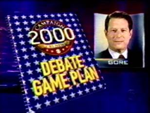
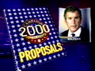
imagery. In a story previewing the first presidential debate, CBS
used a graphic representation of a notebook before reporters focused on
the Gore and Bush perspectives respectively. The Gore notebook was
labeled "Debate Game Plan," however, while the Bush notebook
was labeled "Proposals." Here, the graphic attempt to
structure related parts of the story is inconsistent with the specific
labels. Gore's notebook suggests a strategy focus, Bush's a policy
focus. This is a subtle difference, but not one without consequence.
Jamieson (1992) found that adopting a strategy schema in previewing stories
in increased the likelihood that viewers would focus on and remember the
strategy elements of the story. It may be that the reporter's and producers
at CBS thought this accurately reflected the two candidates' orientations.
Or it may have been inadvertent. Either way, however, it serves
to illustrate the complexity of using visual images to structure elements
of an extended feature or analysis (see Figure 14).
|
Figure 14. Using graphic images to link related elements in extended stories |
||
|
||
|
The purpose of this examination has been to explore the ways that analysts
might more effectively use visual linkage to communicate, especially in
the context of campaign coverage. In general, admakers have been
more aggressive in engaging the visual than have journalists. An
ad produced for Jon Corzine, Democratic candidate for the US Senate from
New Jersey is a particularly instructive example of how graphics can enhance
visual linkage and communication. By dividing the screen into quadrants,
the ad links opposition candidate Bob Franks to both the emotionally laden
image of Newt Gingrich and to specific votes Corzine alleges were not
in the interest of New Jersey voters. In subsequent frames of the
ad, the same visual structure is used to Link Franks's voting record with
a visual image of a hospitalized child who presumably would be harmed
by Frank's policies (see Figure 15).
|
Figure 15. Complex visual linkage |
||
|
||
|
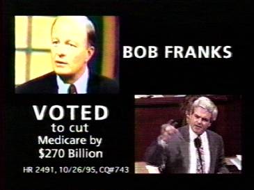

The graphic structure of the Corzine ad offers a model for analysts.
The ad combines visual association and a recognizable structure to communicate
effectively. Shifting Franks's image from the left corner of the
screen to the right punctuates the shift in association from who he is
for to who he is against. It is my suggestion that journalists would
be well advised to consider such visual details as a way of more effectively
communicating in an increasingly visual age. One final example further
illustrates the analytical potential of graphic visual imagery.
The CBS story on the crimes committed by violent and mentally unstable
Texans carrying concealed weapons under a law Governor Bush signed, includes
a graphic representation of a manila folder labeled "concealed weapons"
on the folder's tab and branded with an outline of the state Texas on
the folder's face. This image is followed by a graphic representation
of the folder's contents: mug shots of the criminal and his victim
and the text "shot girlfriend; claimed it was suicide" superimposed
over the image of a typed report. In general, the use of visual
graphics in this story was highly effective, and these images are particularly
evocative (see Figure 16).
|
Figure 16. Linkage in graphic visual imagery in news |
||
|
||
|
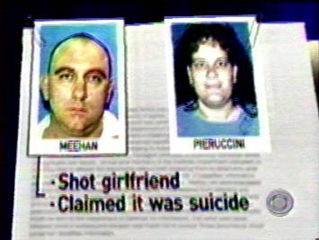
Yet it is still possible to more effectively communicate the visual linkage, ultimately to candidate Bush, as the story intends. The two images could be faded together, and the graphic outline of the state of Texas could remain, superimposed over the image of the content of the folder. Such details may seem trivial, but it is in the details where the devil lies.
Additional Suggestions for Engaging Visual Communication
Beyond adopting the visual communication techniques of admakers, journalists may be able to draw upon the insights of academic research on visual communication. Tufte, contemplating how to combat manipulated visual imagery wrote:
One way to enforce some standard of truth-telling is to insist that the innocent, unprocessed natural image be shown along with the manipulated image, and, further, that the manipulators and their methods be identified. If images are to be credible, their source and history must be documented. And, if an image is to serve as serious evidence, a more rigorous accounting should reveal the overall pool of images from which the displayed image was selected. (1997:25)
One intriguing possibility for applying this approach to political advertising would be to combat the use of unflattering slow motion video by playing the video at normal speed. Then, the audio track, containing the attacking candidate's message, would sound speeded up and distorted. The effect could be quite powerful.
With ads like the Bush-Cheney campaign's "Really?," (Figure 6 above) analysts could place the video sequences in their proper chronological order, provide the suppressed context, and offer evidence to counter the ad's false implications, both about Vice President Gore's remarks and about "press" reaction to his criticisms of Bush's social security proposal.
In terms of the visual elements of campaign coverage more broadly, and visual reporting in general, journalists might be well advised to consider Tufte's observation that, "information displays should serve the analytic purpose at hand; if the substantive matter is a possible cause-effect relationship, the graphs should organize data to as to illuminate such a link. Not a complicated idea, but a profound one" (1997:49).
Finally, both academic analysts and admakers have recognized the powers of parallelism. Tufte put it this way:
Embodying inherent links and connections, parallelism synchronizes multiple channels of information, draws analogies, enforces contrasts and comparisons. Our examples have inventoried all sorts of design strategies that collate like with like: pairing, orientation, simultaneity, overlap, superimposition, flowing together on a common track, codes, pointer lines, sequence, adjacency, similar content. Parallelism provides a coherent architecture for organizing and learning from images – as well as from words and numbers, the allies of images. And by establishing a structure of rhythms and relationships, parallelism becomes the poetry of visual information. (1997:103)
This project has sought to make the case that such greater attention to detail can help journalists more effectively use visual imagery to communicate with their audience. Will adding a graphic overlay of the state of Texas on a computer graphic identifying the victims of violence tied to a concealed weapons save campaign discourse? Of course not. But if doing so signals a willingness on the part of the media to aggressively engage visual communication, it will may be a good thing for campaign discourse and engagement.
This work, however, also points to the limits and liabilities of the
mainstream media as a vehicle for the critical analysis of campaign communication.
If Graber's optimism about the enlightening potential of visual communication
is to be realized, it will require the efforts of many voices and visions.
The role the internet can play in this endeavor is readily apparent. The
challenge lies in cultivating the cadres of visual analysts necessary
to fulfill the task. No doubt they will have to be drawn from far and
wide, and while "alternative" media outlets (perhaps even MTV)
may rise to the occasion, it may be that a new generation of students
and faculty in fields such as communications, design, journalism, political
science, and related disciplines can ultimately best carry the effort
forward. Perhaps the story of a group of journalism and law students at
Northwestern University who helped exonerate four men wrongly convicted
of murder (Protess
and Warden 1998) can serve to inspire the public spirited political
communication projects that could finally realize the liberating potential
of visual communication.
Works
Cited & Endnotes
Back to Top
Home | Current
Issue | Archives
| Editorial Information
| Search | Interact